Design: Harm-Jan van der Mark
Agency: ES&C
Animations: Cape Rock
For NH media I was asked to update the brand identity of their main brand ’NH'.
Their former identity was seen as static, corporate and distant. The logo had to be more open and friendly and also had to work as an icon. Besides it had to fit with their new strategy of being in continuous conversation with the inhabitants of the region of Noord-Holland. The logo had to be easy to animate and smoothly fit into the mobile world as well as stand out on a TV screen.
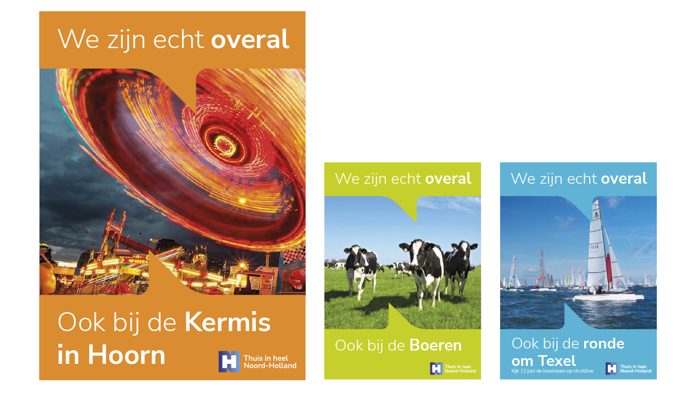
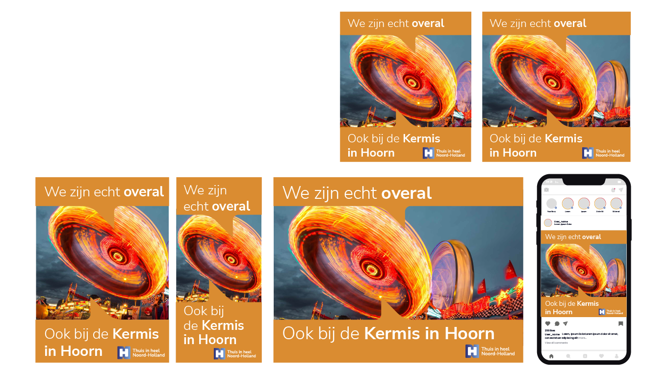
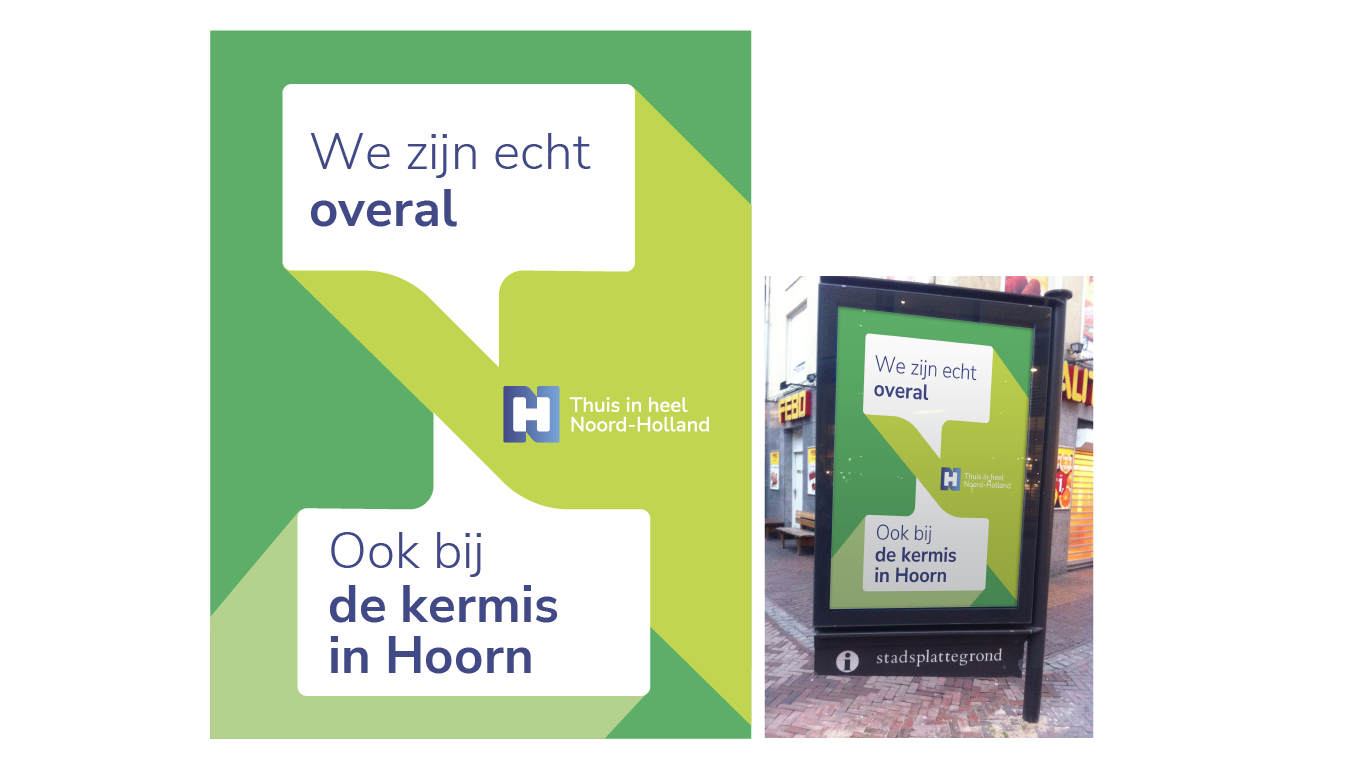
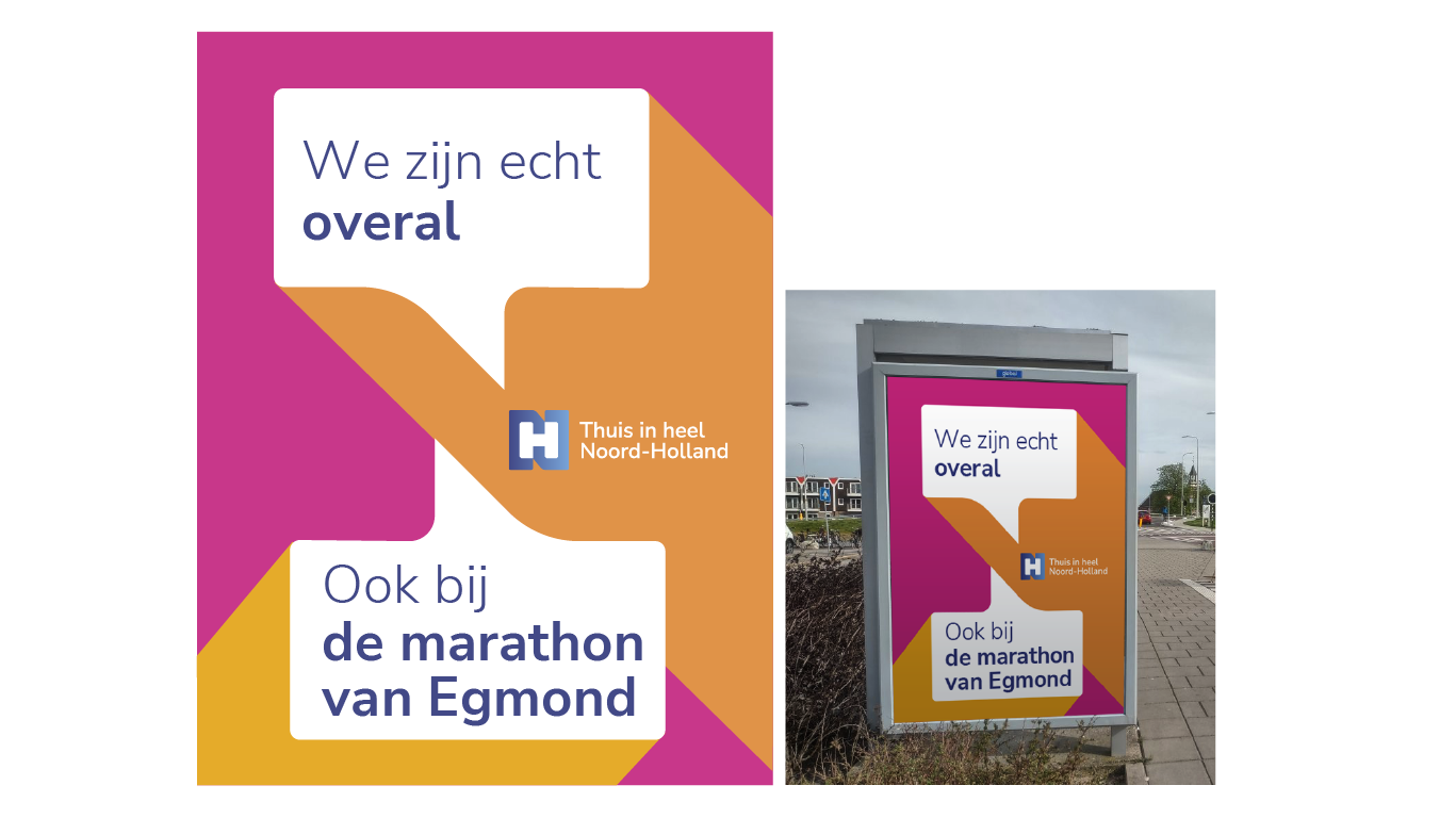
After several rounds of concepts the result was a logo that holds it all together. The negative space of the N can be used as speech bubbles - symbolising the conversations - which will be used in media campaigns and program bumpers.

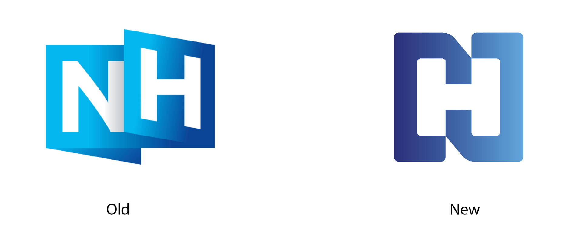
The negative space of the N shape provides us the basic shape of speech bubbles which relate to being in communication with the target audience: the people of Noord-Holland.
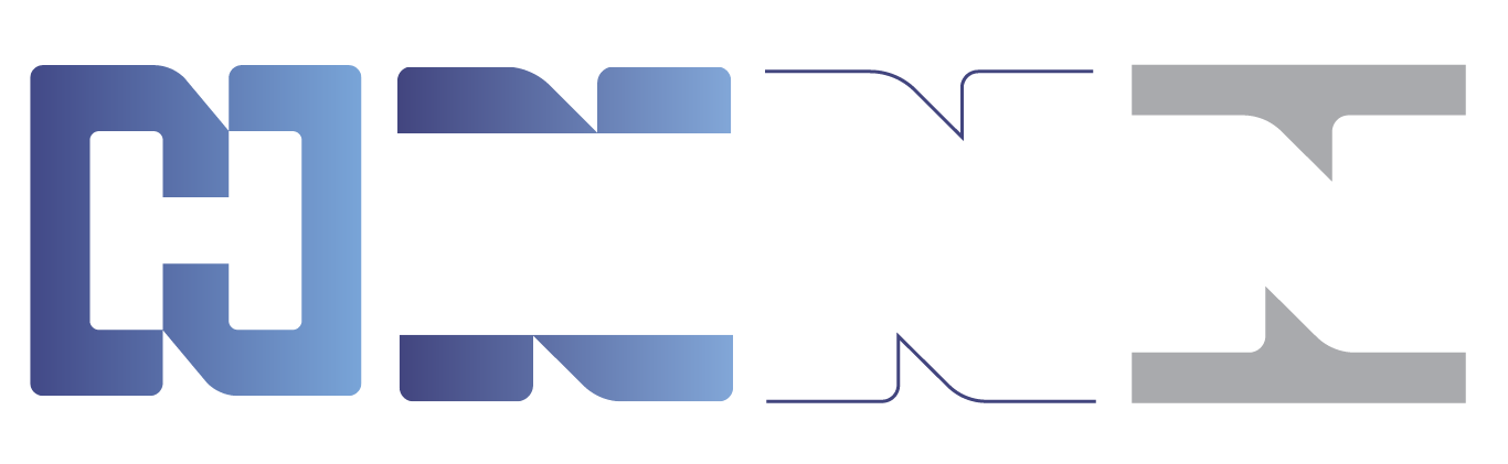
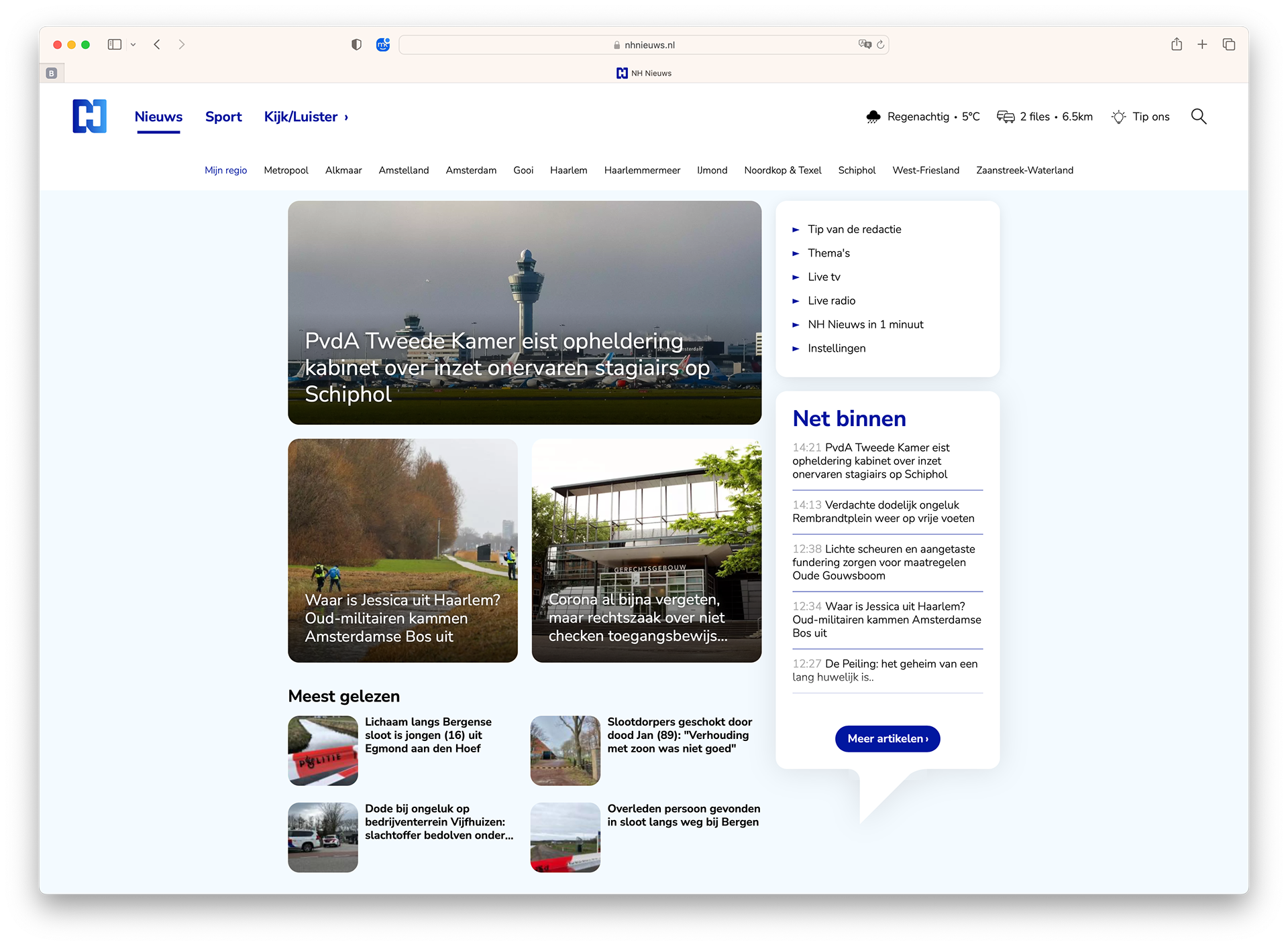
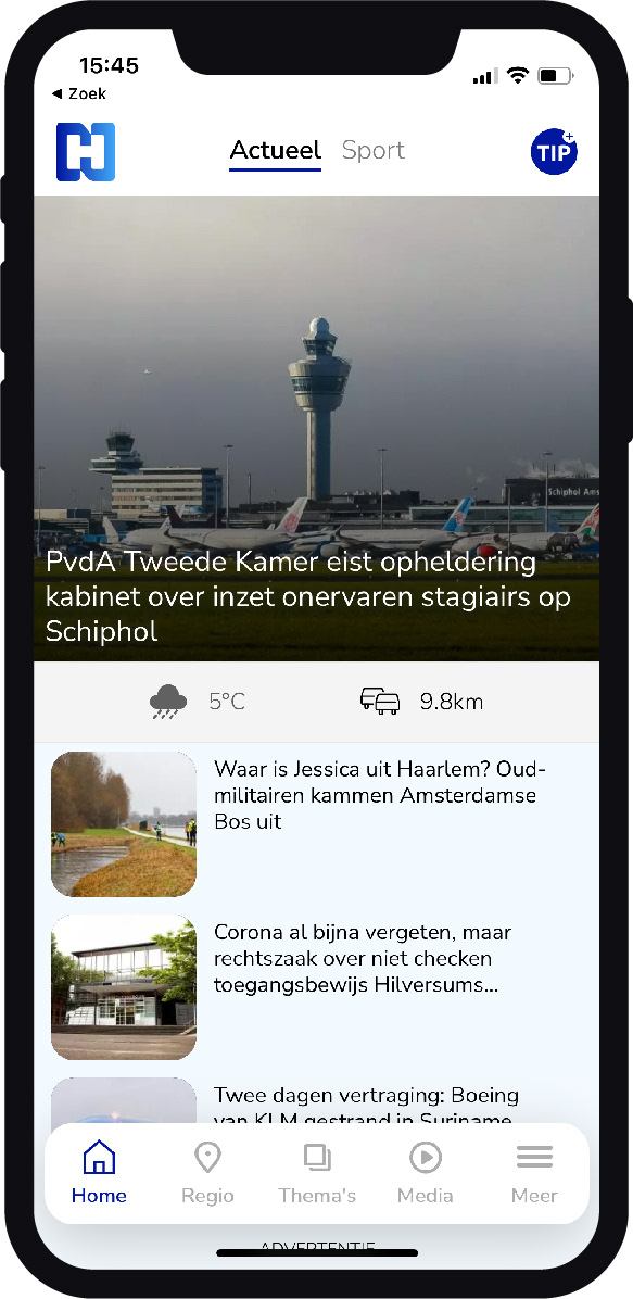
We developed a brand identity that positioned the logo and the shape central to everything.
It's all recognisable in its simplicity; the website, the app, program idents, etc.
Media campaign using photography
Media campaign using graphic language
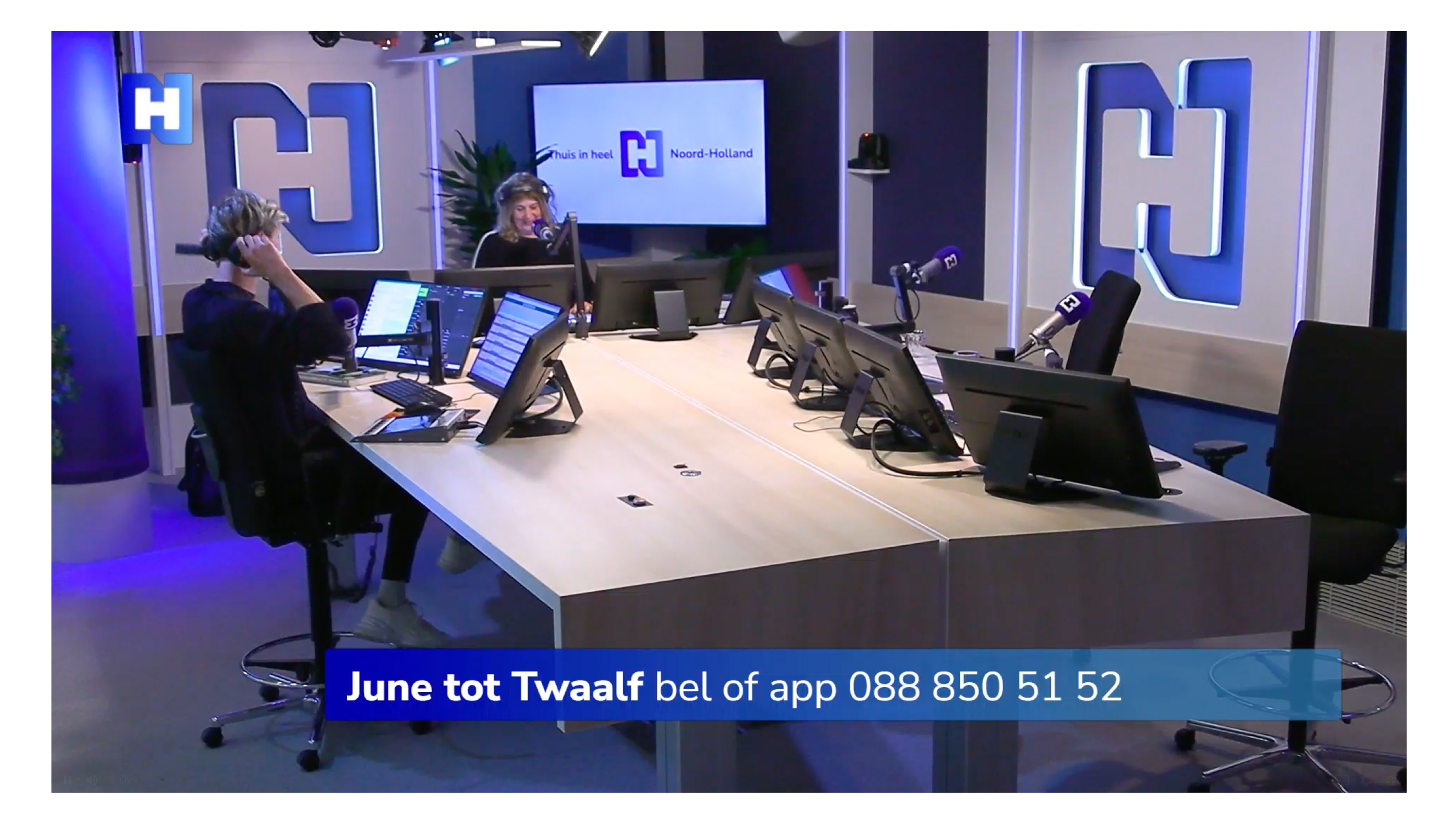
Radio studio design
An animated version of the logo is used for various
in-app, online and tv channel purposes
NH Channel ident
NH News ident
Program ident example. Many variations for many different programs are made using the new color palet
NH Sport ident